About the project
ACT IN_OUT is an international initiative of multiple cultural institutions from Poland, Iceland and Norway.
The cooperating institutions have created a rich program of events: concerts of independent Polish and Icelandic bands, literary and musical performances, seminars for music and theater managers and producers, as well as educational activities for young people, including workshops and discussions. The two-year ACT IN_OUT project also includes artistic residencies.

Preparing branding for this type of project was a considerable challenge – the combination of cultures, sounds, forms and arts that occurs during ACT_IN OUT should have been visibly presented. Creating a visual identity was not a matter of a spiritual revelation, but an in-depth analysis. Our initial idea was to reflect on how one can create a recognizable and coherent whole from a set of individual elements.


The visual identification of the project and its website required the creation of such a set of elements that are understandable and relevant in an international context. They had to reflect the multidisciplinarity of the project without overshadowing its most important part, i.e. events.
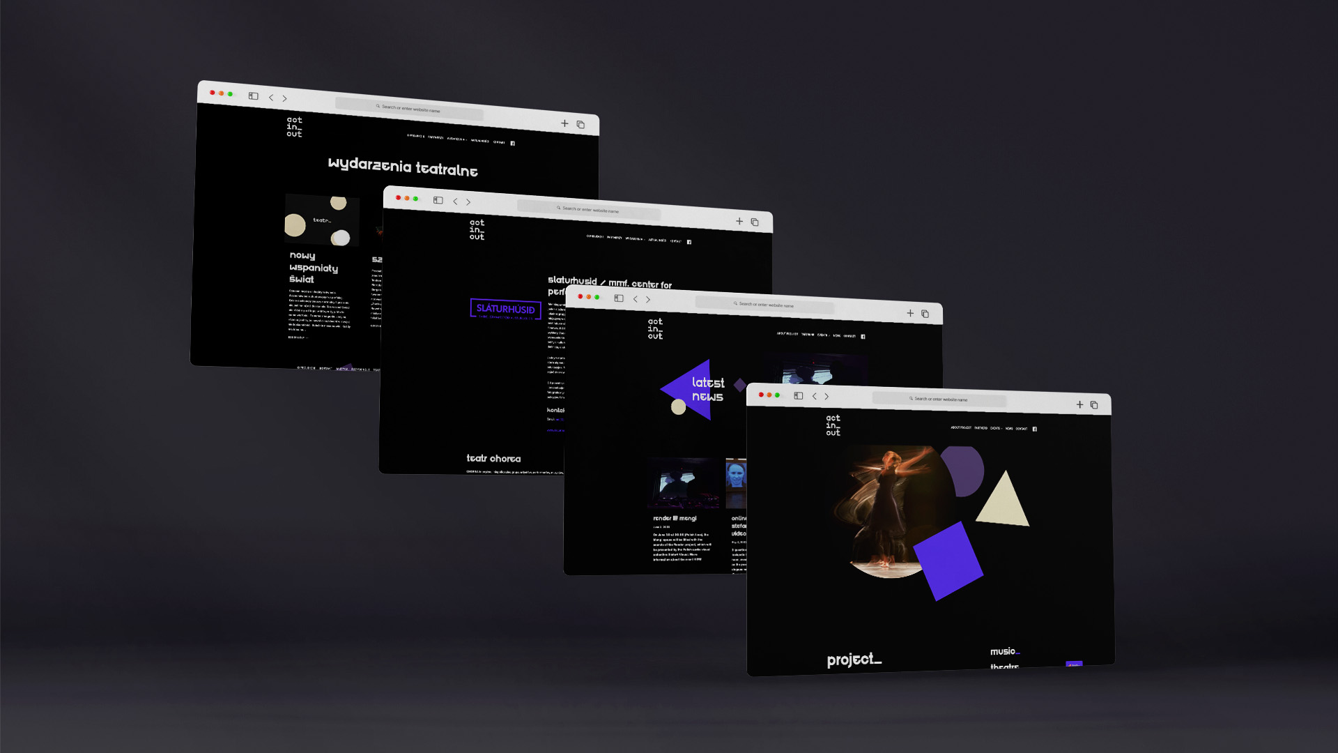
We decided to focus on expressive colors and simple geometric shapes matching each of the categories. Three main colors and three main shapes, each assigned to a single theme, formed the basis of the identification. Shown together, they form a coherent whole. Using the visual code we have created, all external graphic designers associated with the event could easily create recognizable, consistent materials for the website and social media.


Project:
ACT IN_OUT - Visual Identity
Client:
ACT IN_OUT / Fabryka Sztuki / HETMAN PR


